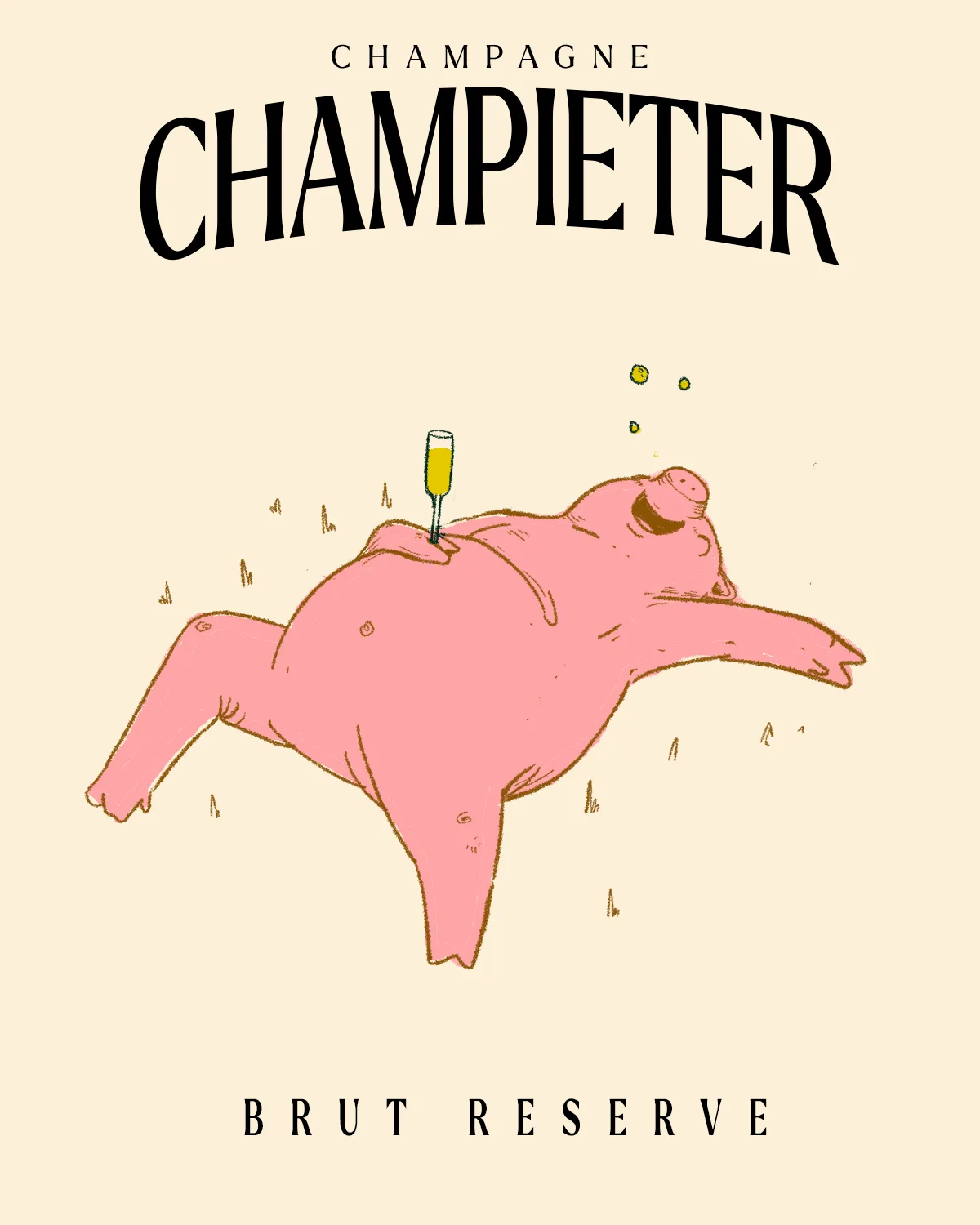
Context
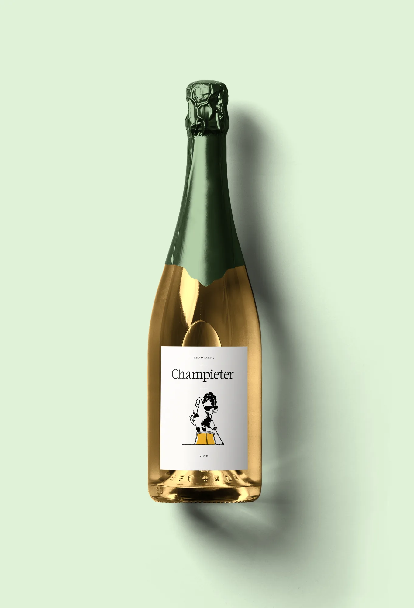
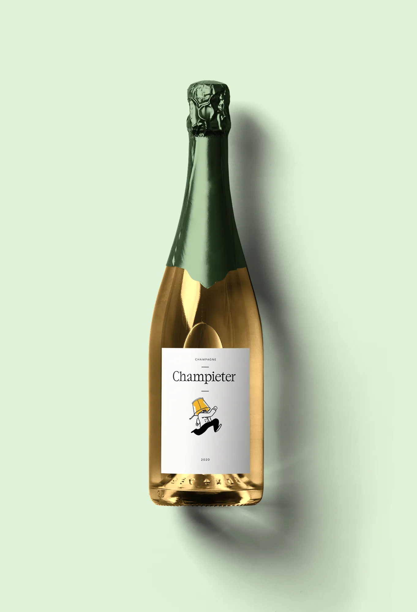
A group of Belgian friends were tired of the champagne industry's rigid rules around naming and presentation. They wanted to push back with a brand that felt charismatic and rebellious but still premium enough for a Brut. The name was a playground between "champagne" and "Pieter," a classic Belgian name. Nico came on as full brand and experiment designer.
Approach
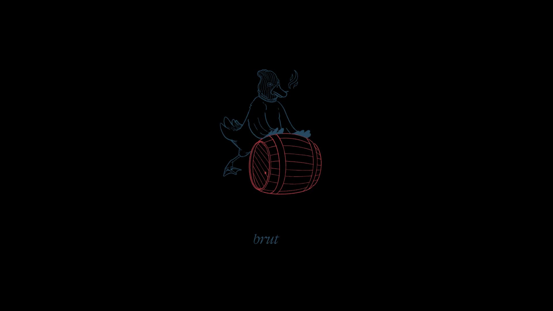
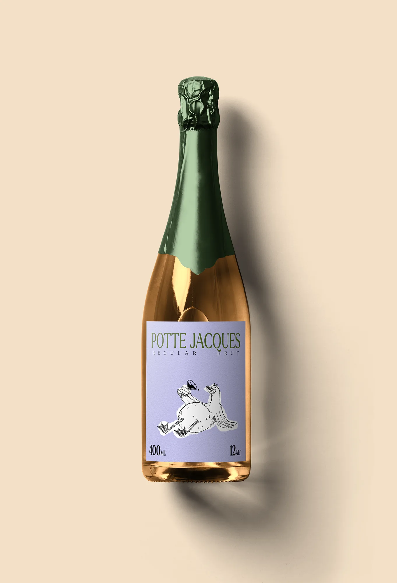
Speed was the strategy. Instead of spending months on a polished brand book, we tested ideas at private tastings with real customers. Story, illustrations, and product experienced together. AI-assisted illustrations helped find the right tone quickly: fighting spirit, a charismatic character, but always premium. The feedback loop was tight, test it Saturday, adjust it Monday.
The Pivot
Then the Champagne region sent a Cease and Desist. The name sounded too close. What could have killed the project became its defining moment. The brand pivoted to "Exile" (Exile), referencing the exile that grapes and farmers suffer when they fall outside the imaginary Champagne border. Now each product is named after the number of kilometers from that border. The illustrations toned down, more elegant. Just a number and a map. The fight became the brand.
Impact
Champieter launched successfully at private tastings and quickly built a following. The Cease and Desist forced a rebrand that ended up being stronger than the original. Exile carries the same rebellious DNA but with a sharper, more premium identity, and a story that people actually want to tell each other.